
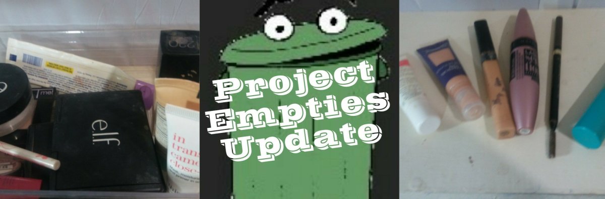

So about a month ago I did a project empties video. You can see that by clicking here. Today I’m uploading my updated list!
So about a month ago I did a project empties video. You can see that by clicking here. Today I’m uploading my updated list!

Recently I purchased a Maybelline City Mini palette off of Amazon. I’ll make sure to leave links down below. I am also going to share a list of all products used for the look. This is somewhat going to be in depth as I tried this palette out a few times before I posted this review.
<!–more–>
I recently did a video on this palette and you can find it here. I also did a foundation routine that you can find the link in the description of that video (once it is up). So these are the products that I used for the look in this video. Keep in mind the prices might be cheaper elsewhere.
Next, I will put up a few images of what this palette looks like and swatches as well. I know that is personally one thing I would like to see. I will try to get them as close to true color as I can with the images, however due to camera and monitor differences on both of our ends they may be slightly different. You can see this actually being applied on the eyes by visiting my YouTube video.


From Left to right is no primer, with primer, and finally on a white base. You can watch the video here to see the actual palette in action.
Now, lets go into the actual review. I got this product as expected on time. I was very please that Amazon had this palate before it hits drugstores. I go into detail about how it feels in my review. It honestly felt very nice and went on smoothly as well. From a distance the peachy/corally color did not seem pigmented though. When I went to do the editing I noticed it was very pigmented and very sparkly (which I noticed even in swatching). So if you don’t like actual glitter I cannot recommend this palette. It is not an actual sheen but little flecks of glitter.
The staying power was not impressive on this palette. It seems to fade away faster than other palettes I have used. I also noted in the review that it can blend away so be aware of that. I tried it on many different bases as well and honestly they did not help it stay much more than bare eye. The bases did help it be more pigmented in some cases, but the staying power did not improve. Adding a setting spray did help some with staying power though. If I dip my brush in the shadow then spritz it with a spray it made it more pigmented as well. There was not as much glittery fallout either with that method so I can recommend that as an option if you buy it.
Those with oily eye lids probably won’t find this palette as the best because of it wearing away as fast as it seemed to on me. I normally do not have a problem with shadows fading away as fast as this did. It seemed that within two hours of application it was already fading. So be aware of that.
I cannot honestly say that I recommend this palette to anyone. I am not sure what Emily Noel, or Tati Westbrook will say about it. Maybe they will try them out as well. If I notice they do I will link their videos here as well.
Today I posted a video showing how close I have to have a mirror or my phone to do my makeup. So you are seeing exactly how I have to have things to see what I am doing. Honestly I like how this came out. I thought I will also go into how companies and other people can help to make beauty more accessible.
Try to imagine this…
You walk into a store in another country with writing you don’t understand. You are looking for a foundation that you know works for you. For example, if live in the US maybe you go to Japan and spot the Maybelline Fit Me foundation. You know what shade you are in by number such as 220. Due to it being a foreign country they don’t have 220 written out rather the numbers are in their script instead. Not very accessible for you right?
That would in a way be similar to what I am talking about here. Only making it more accessible for those with disabilities rather than the example. I simply gave that example so that maybe it would help those that are not visually impaired understand a little better.
<!–more–>
Products Used
My vision
I was born with Optic Nerve Atrophy with Nystagmus and a cleft lip and palate. So I have had a lot surgeries to repair my face. I had experimental surgery in 2014 to try to repair my vision as well. My condition basically means my optic nerve didn’t develop right in the womb. My vision is currently at 20/600 in my left eye and 20/400 in my right eye. Vision acuity means basically what I can see at twenty feet people with perfect vision can see at four hundred and six hundred feet. In other words what someone with good vision can see at thirty feet I have to have at one foot. So being able to see is kinda hard for me at times especially when things are standing in the way of making it accessible. That is why I decided to post this post alongside my video.
Displays
Displays are the main area that I think I should start. I am going to focus on the categories of foundation, lipsticks, and liners as these are the three areas that I see the most help being needed in this aspect. Mainly that these are not clearly marked enough to tell what shades are what. They aren’t clearly marked so it makes it harder for someone with vision impairments to find the shade they want. Especially for foundation and liner. Lipsticks it is easier if the color is on the facing of the display. However some displays are difficult to tell while some are clearly marked but due to the next topic the wrong product is still bought so that is a lack of attention by store staff to ensure everything is in the proper place.
Packaging
One major factor in being able to tell what things are for me is packaging. I am not sure if you have seen it, but I go on a mild rant about packaging of a mask in one of my videos. You can find that video above. I find it is difficult to see what shade things are because the print is so small I can’t read it or the print is such a light color that I cannot read it. Some products as I have mentioned in my Foundations video have the shade number well identified. You can see what I am talking about in the video below. The Maybelline Fit Me series of foundations and Covergirl Ready Set Gorgeous are the two brands that I think do an awesome job.
Directions
The directions also could be a lot clearer. I made a point about this on the mask video I mentioned earlier as well. They are not clear and easily read. This can make application of a product very difficult for the person if they can’t read them. I know there is a space issue, but it is possible to do a sticker or a QR code on products for people who can’t see it to easily get information. Not all products have that, but some do which is amazing. That is very helpful. It can even be put on foundations in the expandable insert that is on some foundations.
Conclusion
I know these may not be a big deal to some of you, but I think those with vision impairments would find it helpful. I hope that companies will make things more visually impaired friendly so that we are able to enjoy it as much and find it as well as other people.
If you have any questions, you are welcome to contact me at any time by visiting my contact me page above. I would love to hear about your suggestions and experiences.
I did a simple GRWM today that I posted on YouTube. I thought I would share it on here as well. I will be sharing my complete list of products used as well. I hope you check it out!
Wanted to let everyone know that there is a St. Patrick’s day tutorial up on my Youtube Channel! I hope you check it out. It can be seen at https://youtu.be/UU300Axzrek
